Simple Tips for Getting in the Habit of Creating Accessible Content from the Start, Part 2: Images and Visual Content Styling
In the previous post in this series, Simple Tips for Getting in the Habit of Creating Accessible Content from the Start, Part 1: Text-Based Content, I discussed some tips on small changes you can make in the way that you create text-based content so that it is more accessible from the start. This was inspired by the main idea in Atomic Habits by James Clear: changes that are very small but applied consistently can make a big difference over time.
We have a lot of resources on accessibility at Emerson, and I encourage you to check them out. Our resources cover accessibility concerns for specific software, like Canvas and Panopto, but there are also principles that are applicable across the board. In this blog post, I’ll be covering tips for images and visual content? What does “visual content styling” mean, if not images? Read on to find out!
Here are three tips for shifting how you work with images and visual content styling so that it’s more accessibility-friendly from the start:
Tip 1: Provide Alt Text for Images
Screen readers don’t have the ability to describe an image on their own, so it’s important to add alt text for any images that you use. Screen readers can read the alt text, and the alt text communicates the description and significance of images. A screen reader will just skip over an image that doesn’t have alt text, and the screen reader user will not have a way of knowing what the image is or its significance.
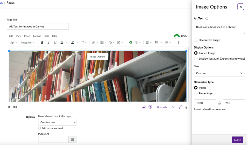
The image below is a screenshot of the image options interface in Canvas, which shows the alt text field. In this case, I added alt text to the image when I uploaded the image. And yes, this screenshot has alt text!

The interface for adding alt text varies according to the application you are using, but this is such an important aspect of accessibility that there should always be a way to add alt text regardless of the application. Here are instructions on adding alt text in some commonly used applications at Emerson:
It’s generally best practice to keep alt text to under 150 characters (1-2 sentences). Also, you don’t need to start the alt text with “image of” or “picture of.” The screen reader will take care of that!
Consider the context of the image when writing the alt text. For example, say that you have a picture of a Monet painting framed and displayed on a wall in a museum. If the image is there because you wanted an image illustrating how art museums display paintings, then the alt text should mention that. If the fact that the painting is by Monet is significant, then the alt text should focus on that.
Still stumped on how to approach writing alt text? Check out Write Alt Text Like You’re Talking to a Friend.
Tip 2: Don’t Convey Meaning Only Through Color, Font Styling, or Other Visual Indicators
If you were wondering what I meant by “visual content styling” earlier, this is an example of that. Do you remember the section from my last blog post about why you need to use actual headers, not simply change the style to bold and a bigger font color? That’s because things like the font styling and size aren’t picked up by screen readers.
To be clear, it’s ok to use font styling and different font colors. (One caveat is that the font colors should have sufficient contrast – more on that in the next section!) But these styling options shouldn’t be the only way that a piece of information is communicated.
For example, let’s say that you have a slideshow for a lecture, and you have a slide at the beginning that outlines the content for that lecture. There are one or two components of this lecture that you really want to emphasize as being important, so you change the font color of the text to red, or you change the font style to bold, or even both. For a sighted user, the difference in the visual styling is perceivable and it can be inferred that these are topics of special importance. However, a screen reader is not going to pick up on the styling differences, and the special emphasis you intend to place on those topics is not communicated. There’s an easy way to fix this, though! You can add a preface such as “Important” to those topics on the outline. Now the meaning of the font formatting is also conveyed through text.
Not conveying meaning through color alone is also important for people who have colorblindness. Examples of what colors can look like with colorblindness are very helpful for understanding what information can be lost when it’s conveyed only through color. I also recommend checking out this video: Use of Color Alone to Convey Information. It has an example of how to make a color-coded event calendar accessible.
Tip 3: Use Colors with Enough Contrast
On more than one occasion, I’ve been in a situation where there were no more pens available (pens do tend to walk away) and needed to use a yellow highlighter to write something down. And I only had white paper. If it was a big yellow highlighter, then I had to write bigger, and I had a chance of actually being able to read what I’d written down. But if all that was available was a small highlighter, I was pretty much out of luck.
You may be wondering why on earth I’ve brought up this anecdote, but I’m using it to demonstrate two important things about color contrast. The first is that light colors on light backgrounds are very difficult to read. They’re even harder to read if you have low vision! The second is that a light color on a light background can be easier to read if the lettering is bigger. It still may not be an acceptable level of color contrast, but the font size does play a role in this. There are tools to help determine sufficient color contrast. Black text on a white background is a safe choice and a classic for good reason!
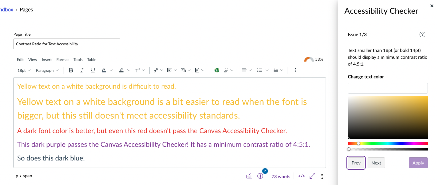
Here is an example of text in different colors and font sizes in Canvas and the Canvas Accessibility Checker’s evaluation of them. To get technical, text smaller than 18pt or 14pt bold should have a minimum contrast ratio of 4:5:1.

For more examples in context, I recommend checking out this video on color contrast. It includes a demo of how to use an eyedropper tool to isolate a color to check for contrast.
I hope this series has taken some of the overwhelm out of the principles of creating accessible content, and inspired you to learn more about accessibility. Feel free to reach out to us if you have any questions! We can be reached by email at itg@emerson.edu. You can also call us at 617-824-8090 during business hours. Business hours for ITG are located at the bottom of https://support.emerson.edu/hc/en-us.


