Simple Tips for Getting in the Habit of Creating Accessible Content from the Start, Part 1: Text-Based Content
When life gets overwhelming, it can be very difficult to initiate new ways of doing things. Looking into ways to cope with this led me to Atomic Habits by James Clear. Spoiler alert: I haven’t read the whole book yet. Luckily, the author has the Atomic Habits Summary on his website. The main idea is that changes that are very small but applied consistently can make a big difference over time.
This is the first in a series of blog posts where I take this concept and apply it to developing habits in content creation that have accessibility in mind from the start. We have a lot of resources on accessibility at Emerson, and I encourage you to check them out. Our resources cover accessibility concerns for specific software, like Canvas and Panopto, but there are also principles that are applicable across the board.
Here are three tips for shifting how you create text so that it is more accessible from the start:
Tip 1: Keep It Simple
There are a lot of fancy ways to style documents and information visually. Unfortunately, very often these present challenges to screen reader software, or are even completely inaccessible. So it’s good to keep the layout and presentation of your documents simple.
Tip 2: Use Built-In Formatting Tools
It’s easy to get overwhelmed by the number of buttons on the ribbon in Microsoft Office, the toolbar in Google Docs, or even the RCE (Rich Content Editor) in Canvas. But getting comfortable with using the formatting features built into the software you use to create content and documents is a great habit. It will save you time in the long run, plus using built-in formatting features helps ensure that your documents are accessible.
As an example, say that you want your document to have columns of text. While it might be tempting to try to create this formatting manually using the tab key, it’s much better to use the column formatting option! That way, a screen reader knows how to read that text in order. If you were doing your formatting with tabs, it may look logical to a sighted user, but the screen reader software doesn’t know how to interpret it. (Here are instructions on how to Adjust column widths on a page in Microsoft Word and Add or delete columns in a document in Google Docs.)
Tip 3: Use Heading Styles
Technically this falls under the category of “Use Built-In Formatting Tools,” but this is important enough that it should be mentioned on its own. The text above this paragraph, “Use Headings,” is a heading! While it may look like a heading is just a stylistic choice using bold text and a larger font than the rest of the document, it has behind-the-scenes information attached to it that lets a screen reader know that it’s a header. To put that more technically, the text is encoded as a header.
For a sighted person, headings are an easy way to scan a document and get a sense of what it’s about and where to find information on specific subtopics. A sighted person does this by looking at the document, noticing that there is text that is larger and bolder than the majority of the text, and noting that the text formatted this way has a special significance. Screen reader software, however, doesn’t interpret meaning in the same way. It’s searching for text that is encoded as headings. Then it knows the significance of that text, presents it to the screen reader user as headers, and the screen reader user can navigate around in the document with more ease.
The key is that you have to use the heading formatting feature! Don’t just make the text bold and bigger. And don’t skip or skip around in heading levels (i.e. go from a Heading 1 to a Heading 3, with no Heading 2).
For a great example of how to apply headings and how they assist a screen reader user, check out this short video from Microsoft: Improve Heading Accessibility. This video shows Microsoft Word, but selecting a heading style across applications is pretty consistent.
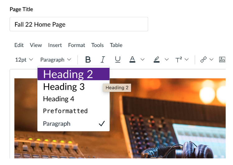
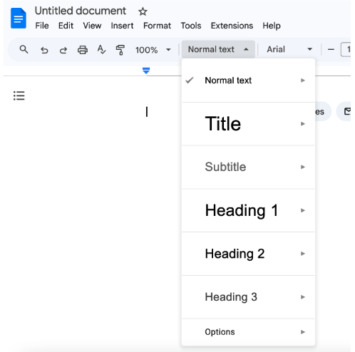
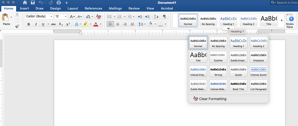
Below are examples of what the heading menu looks like in Canvas, Google Docs, and Word.
Headings in Canvas:

Headings in Google Docs:

Headings in Microsoft Word:

Feel free to reach out to us if you have any questions! We can be reached by email at itg@emerson.edu. You can also call us at 617-824-8090 during business hours. Business hours for ITG are located at the bottom of https://support.emerson.edu/hc/en-us.
Part 2 in this series will cover some tips for accessible images and visual content.


