Understanding Links in Canvas
Links (or hyperlinks) are such a ubiquitous, fundamental part of the internet that it’s easy not to give them a second thought. However, you can make your life easier by learning a few things about how links work in Canvas!
First, it’s important to understand that there are two different types of links in Canvas: course links and external links.
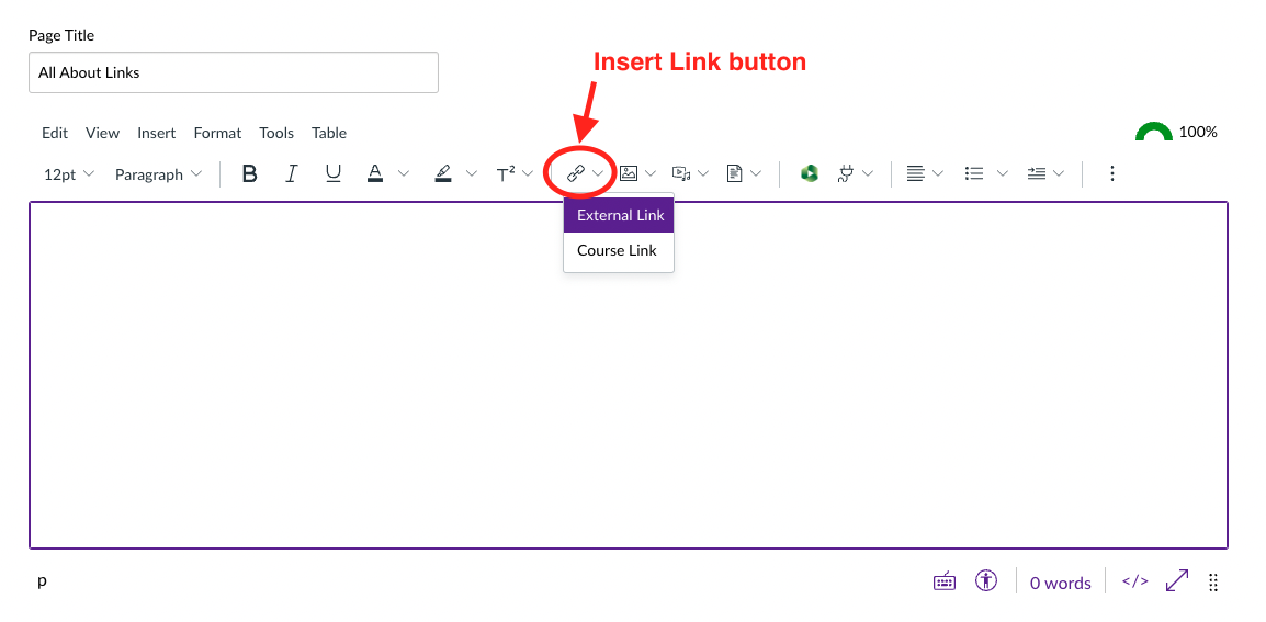
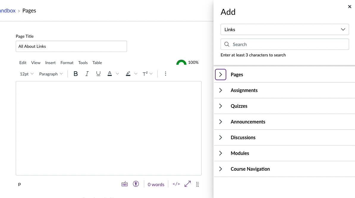
Course links are links to content within Canvas. For example, you may want to link to a page from your syllabus. Most likely, your first instinct will be to copy the URL/web address from the address bar of your browser. But wait! In Canvas, it’s crucial to use the Course Links tool in the Rich Content Editor. This tool will provide you with a list of content in your Canvas course. From there, you can click or drag and drop the content that you want to link to.
Why do we need to use this method? Canvas has a lot of content, and the background structure that organizes that content can change in ways that aren’t visible or obvious to us. Using Course Links means that you don’t have to keep track of this. What happens in Canvas is a microcosm of what happens on the internet at large, so you’ve certainly encountered this issue in the form of the dreaded “404: Page not found” error message when browsing.
This brings us to the other kind of Canvas link: external links. External links are links to anything on the internet that’s not within Canvas. Here you can use the familiar method of copying and pasting a URL/web address from the address bar of your browser. Just make sure that when you insert the link into your Canvas course, you insert the link using the hyperlink icon or from the toolbar in the Rich Content Editor.
Library Resources and Permalinks
There is a category of external link that warrants special considerations: links to library resources. Iwasaki Library has a wealth of information, and you can give your students direct links to catalog records, ebooks, journal articles, streaming multimedia resources, and more. Here is another instance where copying and pasting a URL/web address from the address bar of your browser can lead you astray. The key is making sure that you use a permalink. Iwasaki Library has helpful information on how to find and identify permalinks, which is pretty straightforward once you know where to look!
Finding Broken Links: The Course Link Validator Tool
It can be stressful and disruptive to the learning process for students to be working on an assignment and discover that the links they need don’t work. While the internet is a constantly changing environment and the occasional broken link is unavoidable, you can minimize the chances of this without having to click every single link yourself. The Course Link Validator tool identifies and fixes broken links (both course links and external links) in your Canvas course. Check our previous blog post Demystifying the Canvas Link Validator for a detailed explanation of when and how to use this tool.
“Hyperlink Blue” and Web Accessibility
These days, the color of a link on a website can vary to reflect the color scheme of a website But there is a particular shade of blue – hex code #0000FF, to be specific – that we tend to think of as the classic or default color for hyperlinks. In her article “Why Are Hyperlinks Blue?” user experience designer Elise Blanchard traces it back to the 1993 release of an early internet browser, Mosaic. Exactly why it was chosen is unclear, but Blanchard suggests that it was due to the rising popularity of color monitors, as well as the limited number of colors that could be displayed on color monitors at the time. (Remember when monitors weren’t full-color?)
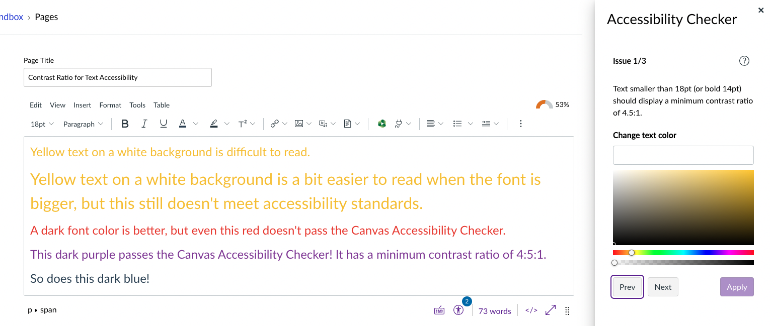
Blanchard also brings up the issue of color contrast for accessibility as a possible factor in the color choice, but notes that “[…]the W3C wasn’t created until 1994 […].” W3C, an internal community dedicated to web standards, has since produced WCAG, or Web Content Accessibility Guidelines. WCAG is an internal standard for making web content accessible to people with disabilities. What Blanchard references here is contrast ratio, a measurement of the readability of text to people with low vision. Check out the example below for a demonstration of contrast ratio. This is a screenshot of the Rich Content Editor (RCE) in Canvas. Accessibility Checker has flagged the yellow text and the red text as not having a minimum contrast ratio of 4:5:1.
Making sure that your color choices have an optimal contrast ratio helps ensure that as many people as possible can read your text. Canvas has built-in accessibility tools that assess numerous accessibility issues, including Accessible Color Choices. Check out ITG’s resource Creating Accessible Canvas Content for more information. As always, please feel free to reach out to ITG with any questions! We’re here to help.
Source:
Blanchard, Elise. “Why Are Hyperlinks Blue?” dist://ed, https://blog.mozilla.org/en/internet-culture/deep-dives/why-are-hyperlinks-blue/. Accessed 11 April 2023.


