Best Practices in WordPress Accessibility Design

Web accessibility word cloud / itjil / CC BY 2.0
Why
Designing for accessibility means that you end up with a site that is clear and helpful to everyone.
More information on Universal Design in higher education
Colors
- Background images or colors should be subtle.
- Make sure that all colors used are high contrast. Try to use light backgrounds with dark fonts. Don’t use red and green together.
- Try testing your site here: color.a11y.com/contrast
Web Style Guide: Visual Design
Layout
- Allow ample white space
- Use sans-serif fonts
Designing Accessible Content: Typography, Font Styling, and Structure
Font Accessibility
Content Organization and Markup
Images
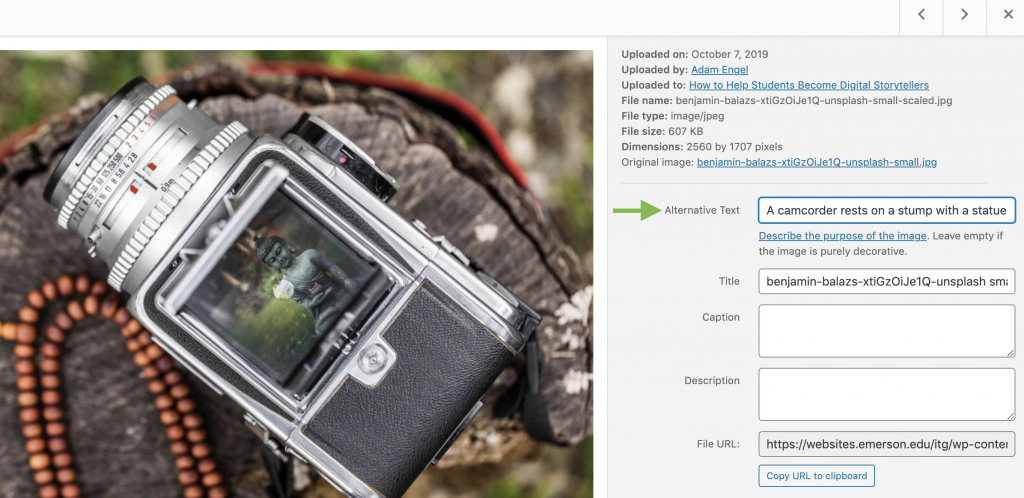
Include short descriptive alt text for all images! This is the most common accessibility error. Use the description field for complex pictures or charts.
WebAIM has a guide for appropriate uses of alternative text.
Video
![]() If you are embedding or linking to a video, be sure that it is captioned and can be controlled through keyboard commands. YouTube can be controlled by keyboard commands. All Panopto videos uploaded will have automatic captions added to them. You can also edit Panopto captions to make them even more accurate!
If you are embedding or linking to a video, be sure that it is captioned and can be controlled through keyboard commands. YouTube can be controlled by keyboard commands. All Panopto videos uploaded will have automatic captions added to them. You can also edit Panopto captions to make them even more accurate!
To learn more: YouTube captioning
YouTube keyboard accessibility
Panopto Accessibility Features
Editing Automatic Captions in Panopto
Formatting

- Use the visual editor as much as possible to organize your content. The BOLD, ITALICS, LIST, UNDERLINE, and BLOCKQUOTE buttons will take care of making sure that the HTML is accessible to screen readers.
- Similarly, instead of messing around with font size and style to create emphasis, use the built-in styles: HEADING 1, HEADING 2, HEADING 3, etc. The theme you have chosen will take care of the font choice and size, but using these buttons will make sure that your content is properly marked up for screen readers.
- Always use heading structures to aid in navigation
- Structure, color, font sizes should be consistent across pages
Links
- Your link names should be as descriptive as possible in case they are read out of context. “IMDB list of documentaries released in 2010 (opens in new window)” is better than “Click Here”.
- Note when you’re directing to a non-HTML resource: “Survey results (PDF)”
PDFs, Word Documents, and PowerPoints
- You can upload these to WordPress, and then link to them from your blog post. When a viewer clicks on the link, they will most likely download the file (though some browsers will open PDFs within the browser window). Make sure that the documents themselves are accessible!
What is an Accessible PDF
Microsoft Word accessibility
PowerPoint accessibility