Learning Curves in New Discussions
Update: Threaded replies by default
While there is much to celebrate in exciting new features, early adopters of new Discussions reported some user interface challenges.
Replies are not expanded by default
In the Split Screen mode you have to click on Reply to see replies. Replies do not appear automatically, like they did in old Discussions.
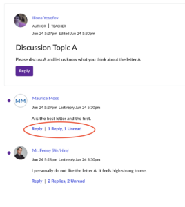
While the split screen layout means a slightly more organized layout, it also means more clicks to view unread comments.
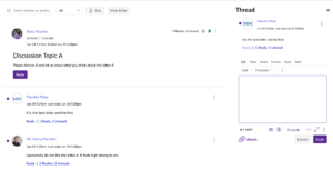
If you’d like to replicate the old discussion experience, you can switch from View Split Screen to View Inline and click Expand Threads.
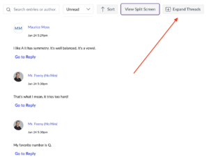
You will then see all comments and replies. If want to see only unread comments and replies, click on ‘Unread’ in the drop down menu.
Users also disliked the extra wide frame and additional ‘white space’ in this new interface. (This should hopefully be fixed before fall semester.)
As of the afternoon of 12/20/24, students will be able to reply to each other by default
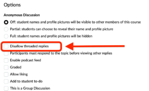
When Canvas was updating discussions last summer, their default was to make discussions without threaded replies (ie, every student can reply to the main post, but they can’t reply to each other). Our faculty mostly want students to be able to reply to each other, so we changed the default to allow threaded replies.
If you want the students to only reply to you and not each other, go to the discussion, choose Options, and CHECK the box named Disallow threaded replies.
Quoting replies also involves many clicks
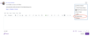
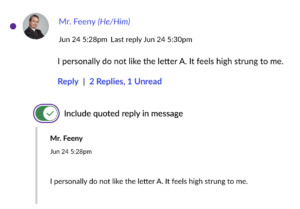
It is very helpful that we can now quote replies easily, but it requires more clicks than we would like. To get the toggle button to include a quote, you first have to click on the vertical ellipsis and then click Quote Reply:
You then get the toggle.
Feedback
We will also be sending out a survey at the end of the Summer 2 to crowdsource advice from summer faculty for your colleagues who will be returning in the fall. If you have feedback for Canvas and would like to participate in community conversations, you can do that in the community forums.

